
Pharmaceutical.
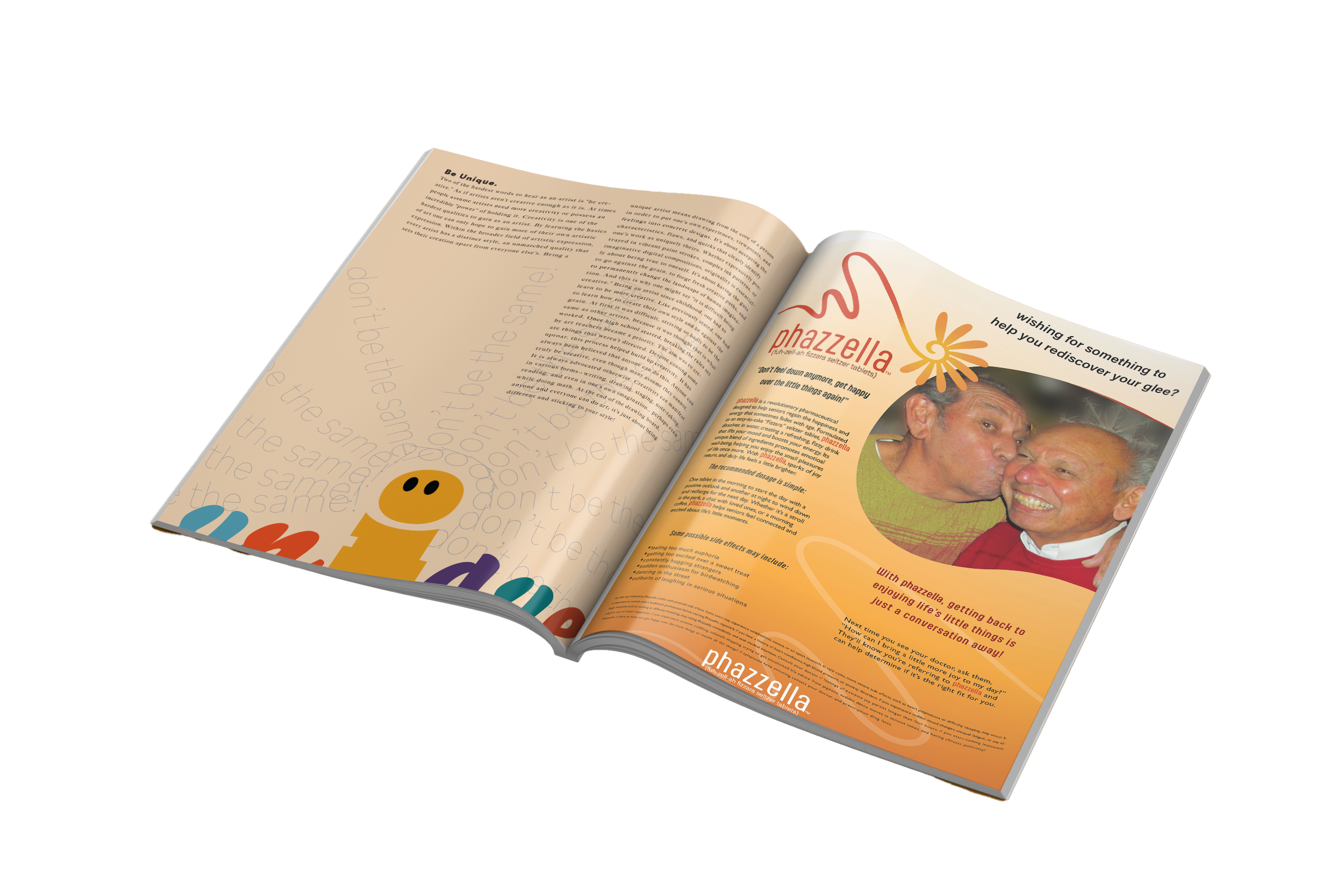
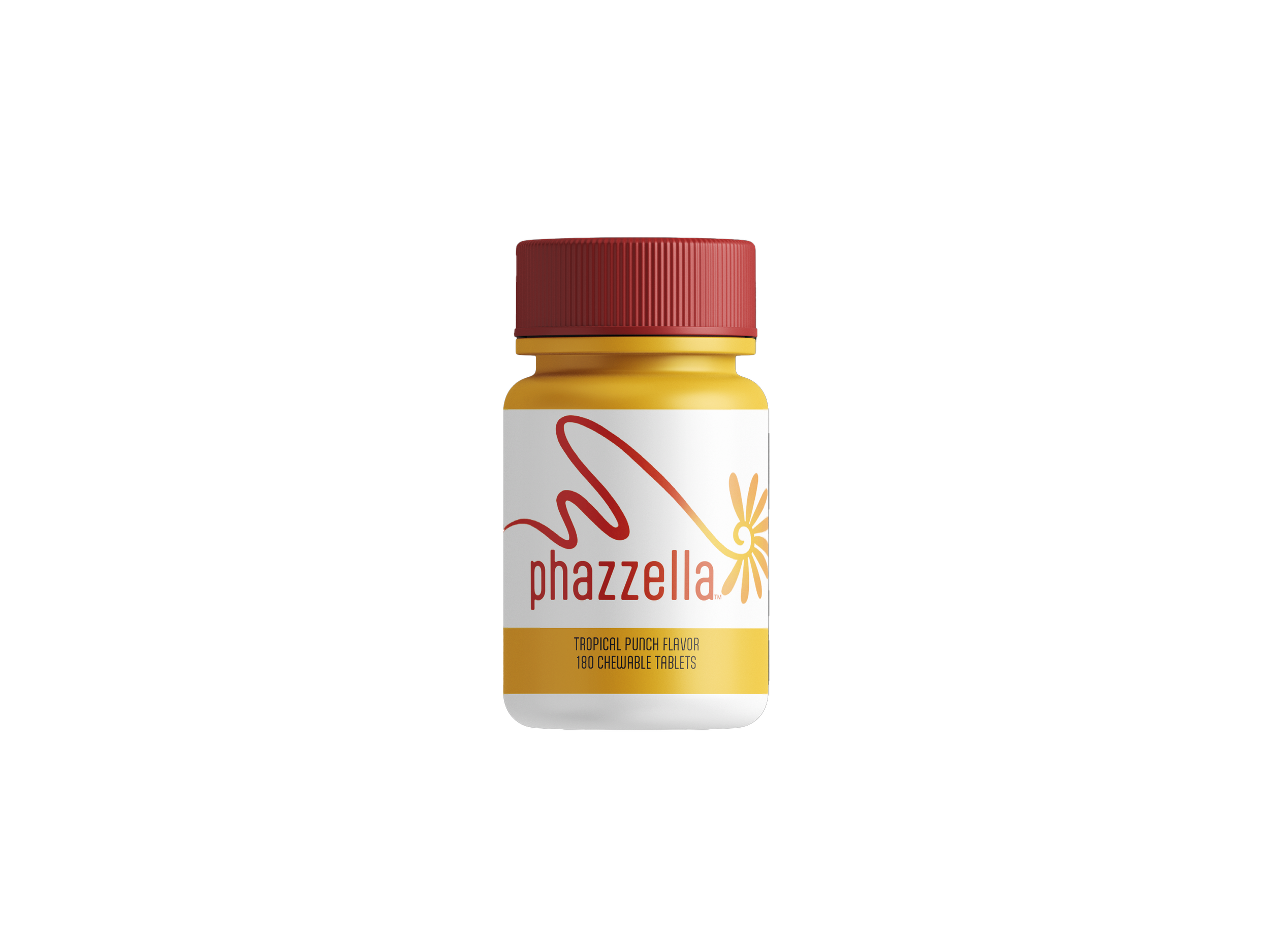
Creating a pharmaceutical ad based on an emotion, I chose the "warm fuzzies." When brainstorming a name, I wanted to play off the word "fuzz" but give it a more pharmaceutical feel—so "Phazzella" was born. I designed this ad with seniors in mind, as they often experience loneliness and fewer social interactions. My logo features abstract imagery combined with warm-toned colors to evoke comfort and connection. The design is intentional, with the end of the logo symbolizing the exact moment when the warm fuzzies hit, wrapping the viewer in a sense of joy and reassurance.

Beginning sketching stages for logo.

Testing top three fonts for type.
Starting to play with logo variations and type.
Chosen logo sketch with type, and now playing around with color scheme.
First few drafts of finalizing a logo.

First version of logo.

First composition of magazine ad.

Second test image for magazine ad, which was chosen after cropping in more and adding more depth/ warmth. With photoshop, I changed the grey sweater to yellow orange to better blend with the color scheme.

First test image for magazine ad, attempting to find one that shows the "warm fuzzies."